
Great graphics don’t happen by chance
THEY HAPPEN BY
APPOINTMENT
Full Branding
Branding created for beauty salon based in Nottingham, UK.
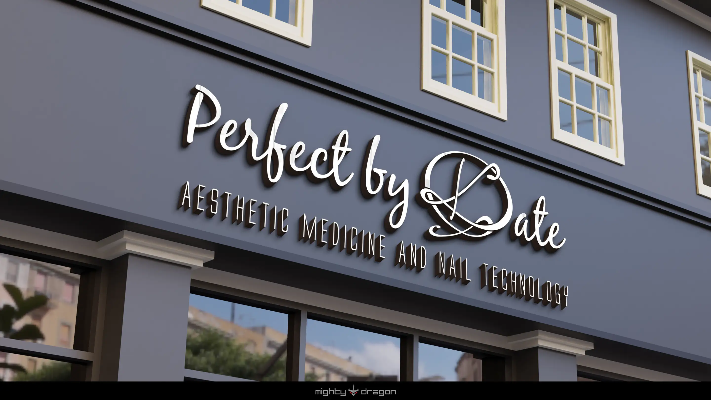
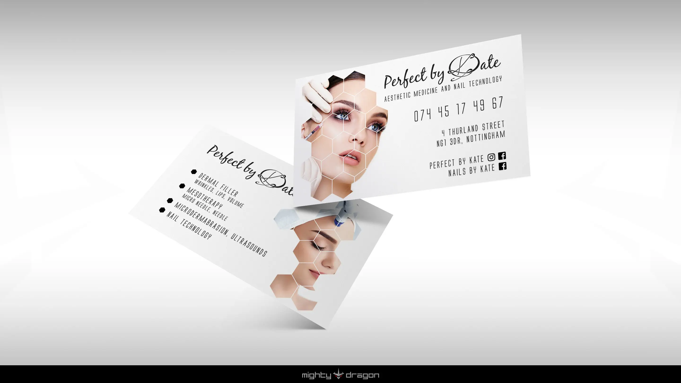
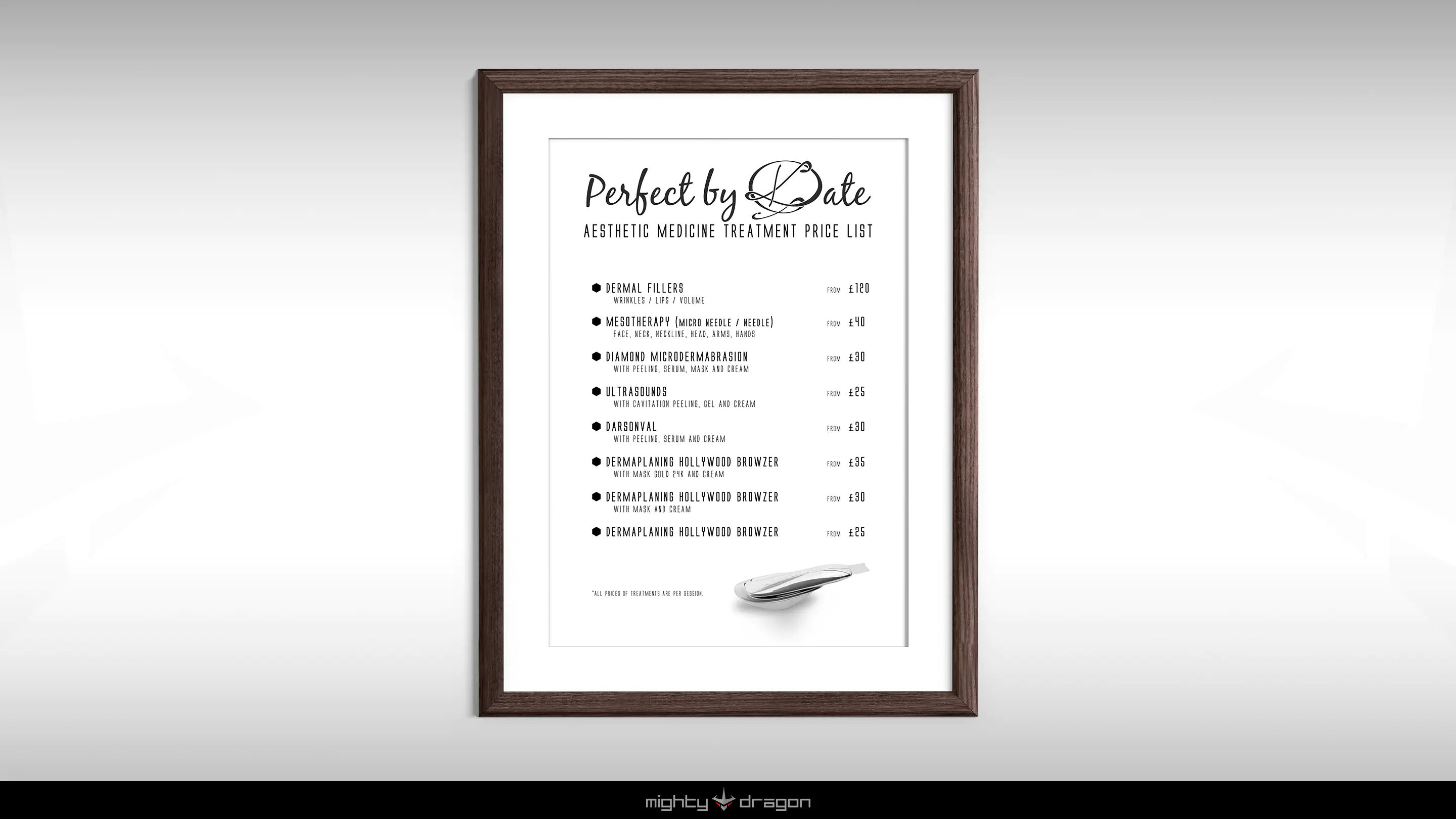
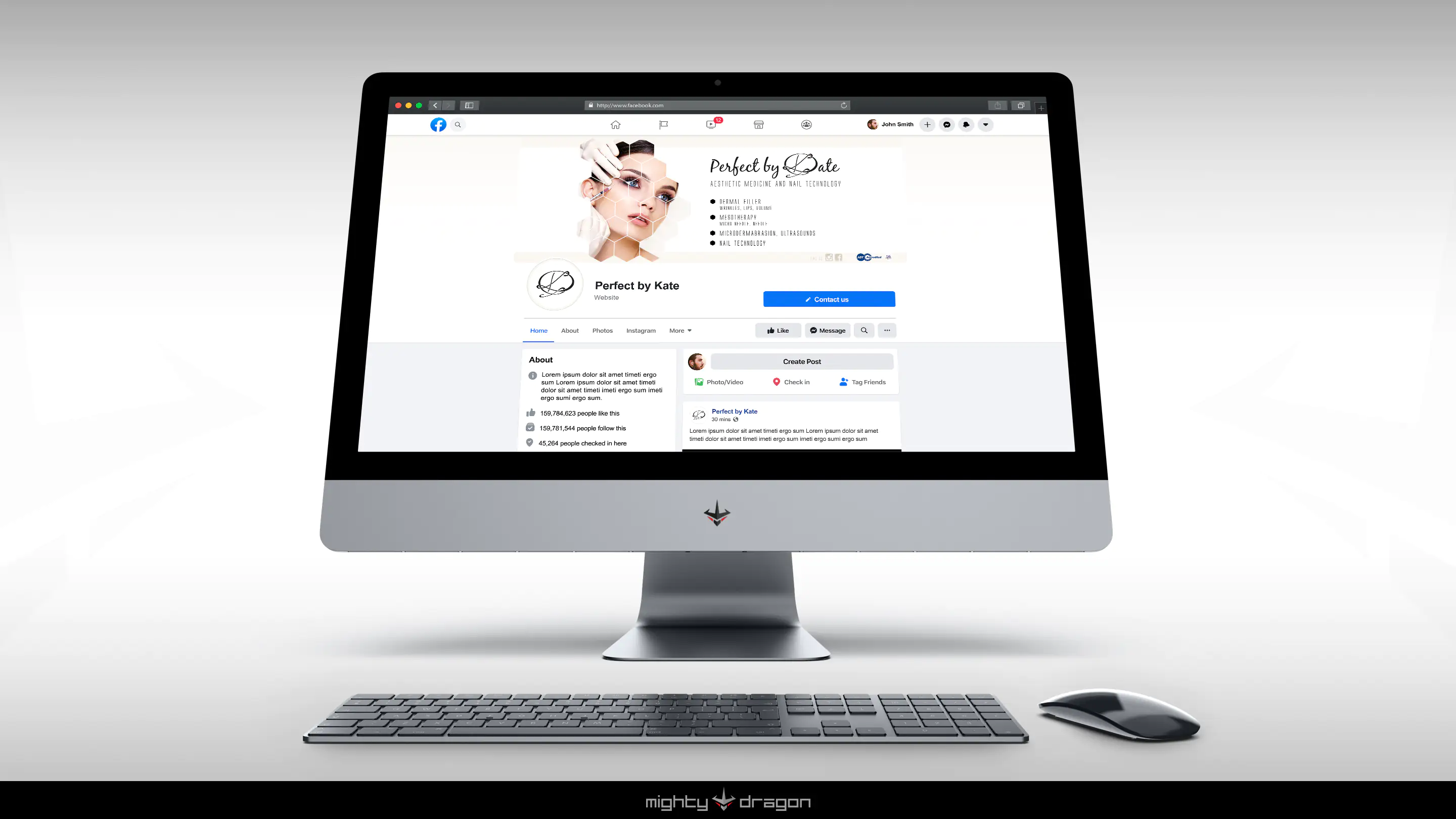
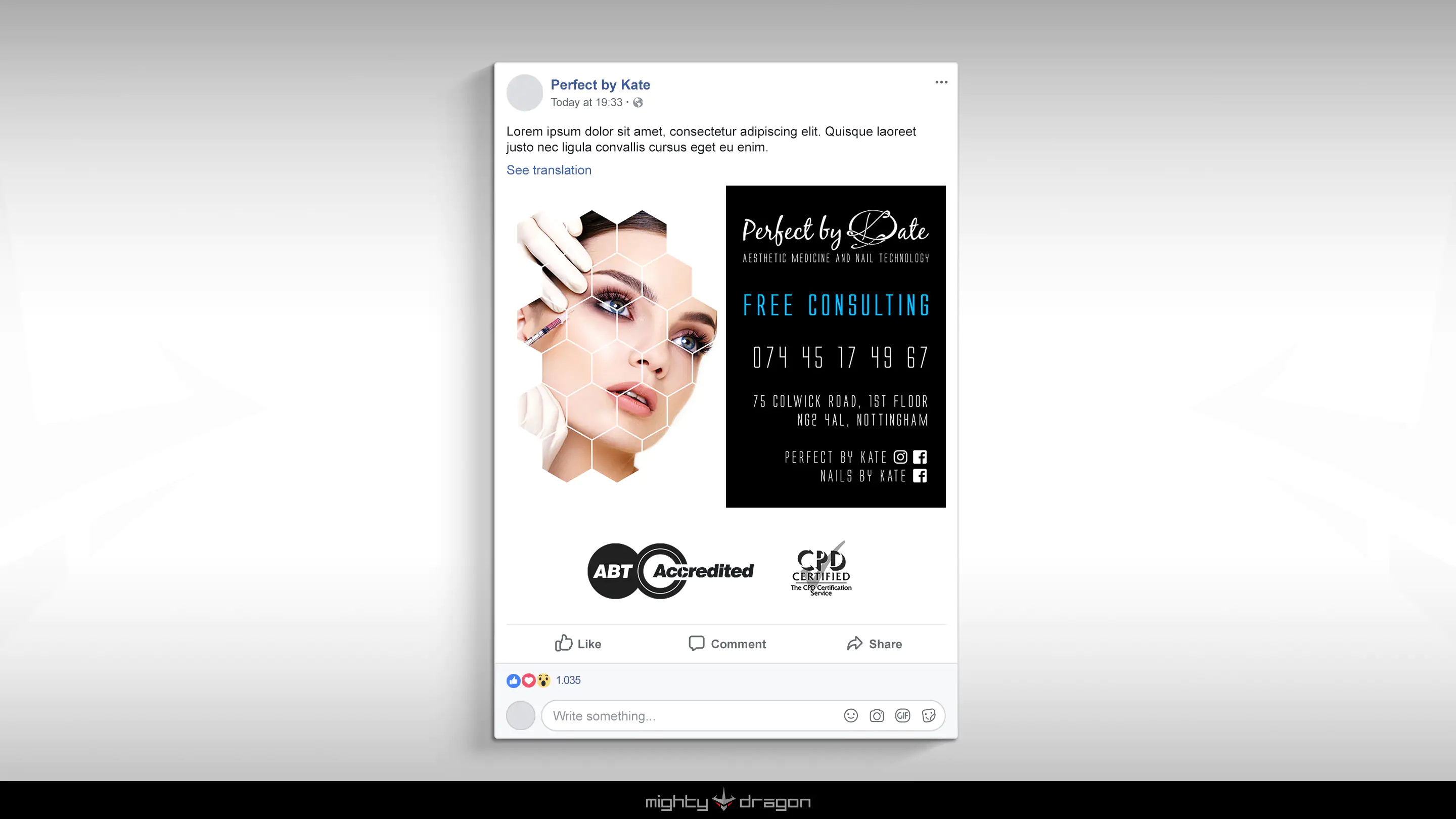
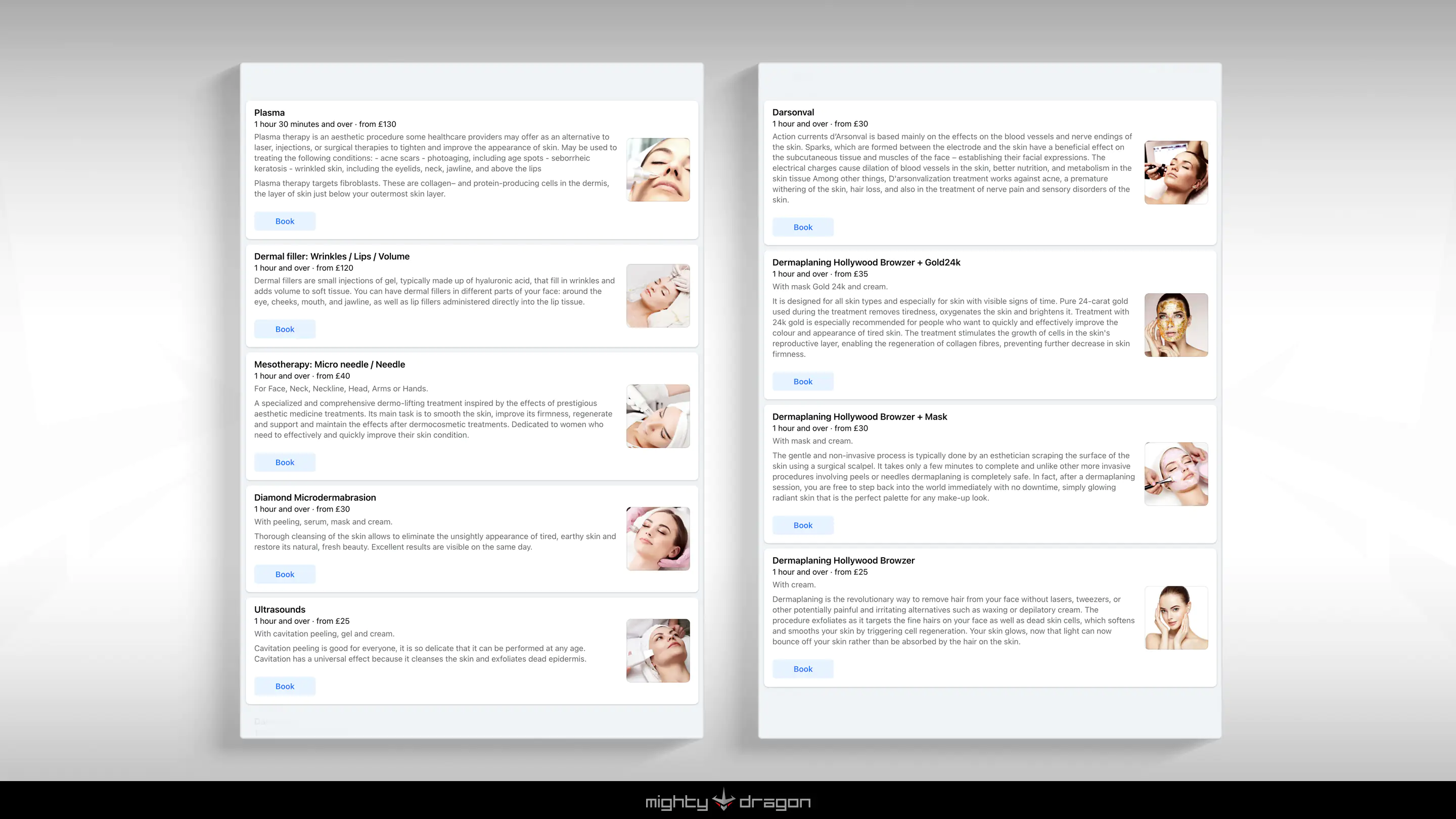
We created a logo for this company, such as business cards, a poster, a price list for their cosmetic services as well as graphics for their Facebook page and a series of advertising graphics for this portal.
Our main task was to create a clean and modern corporate image.
We therefore relied mainly on white, which emphasises the sterility of the cosmetic environment, while the photos depicting cosmetic procedures are presented in a grid of hexagons, which emphasise the company's modernity.
The letter "K" in the logo is based on the handwritten signature of the company owner, and the rest of the letters are matched to form one whole with it.
| Client: | Perfect by Kate |
| Sector: | Beauty | Cosmetics |
| Year: | 2020 |


 Now you know - we only use good and tasty cookies, which are necessary for our website to work. No tracking, no marketing... No fuss!